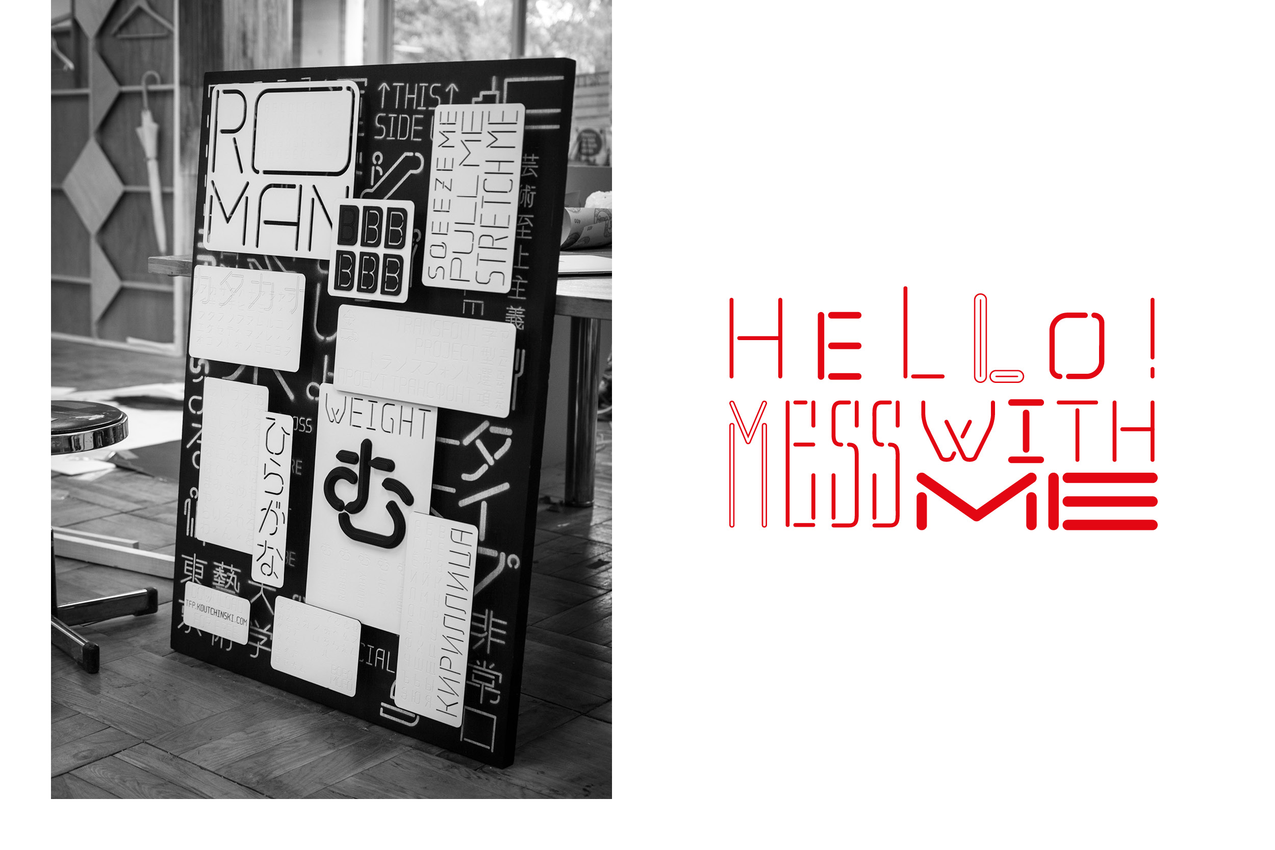
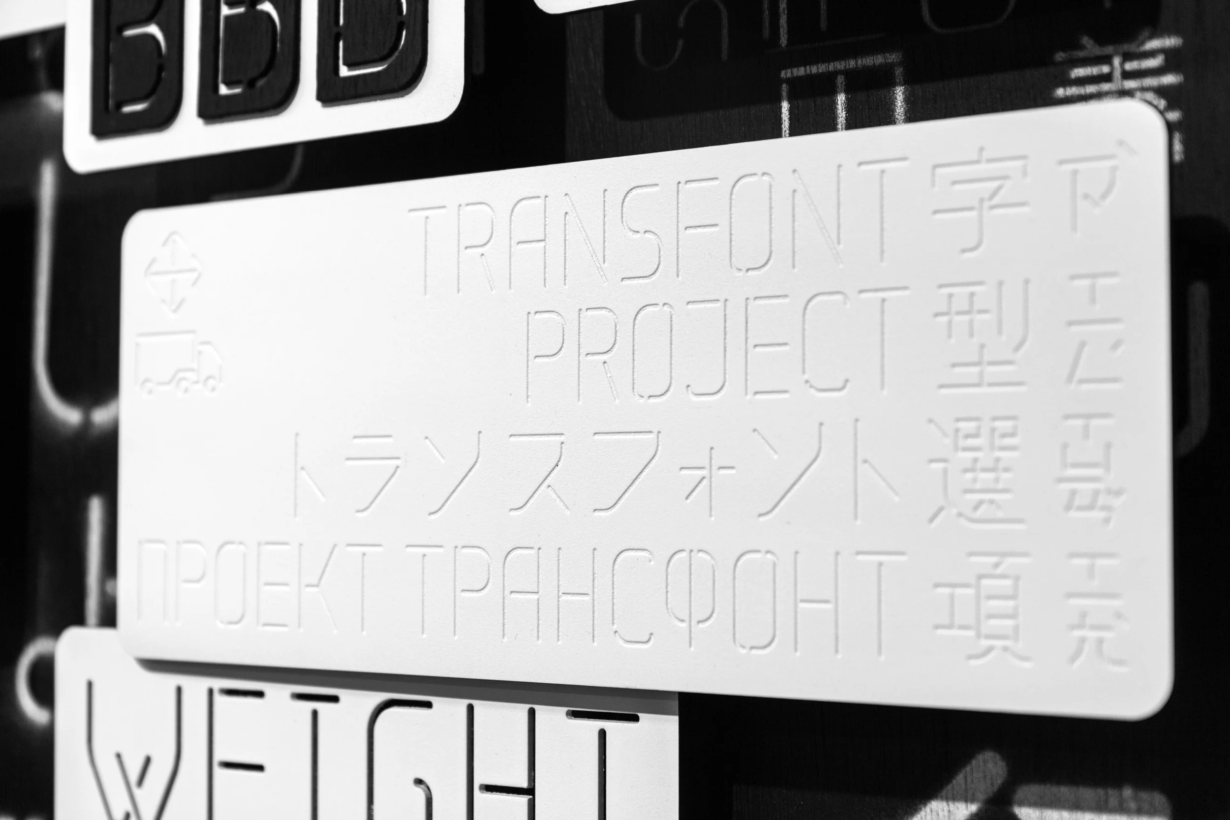
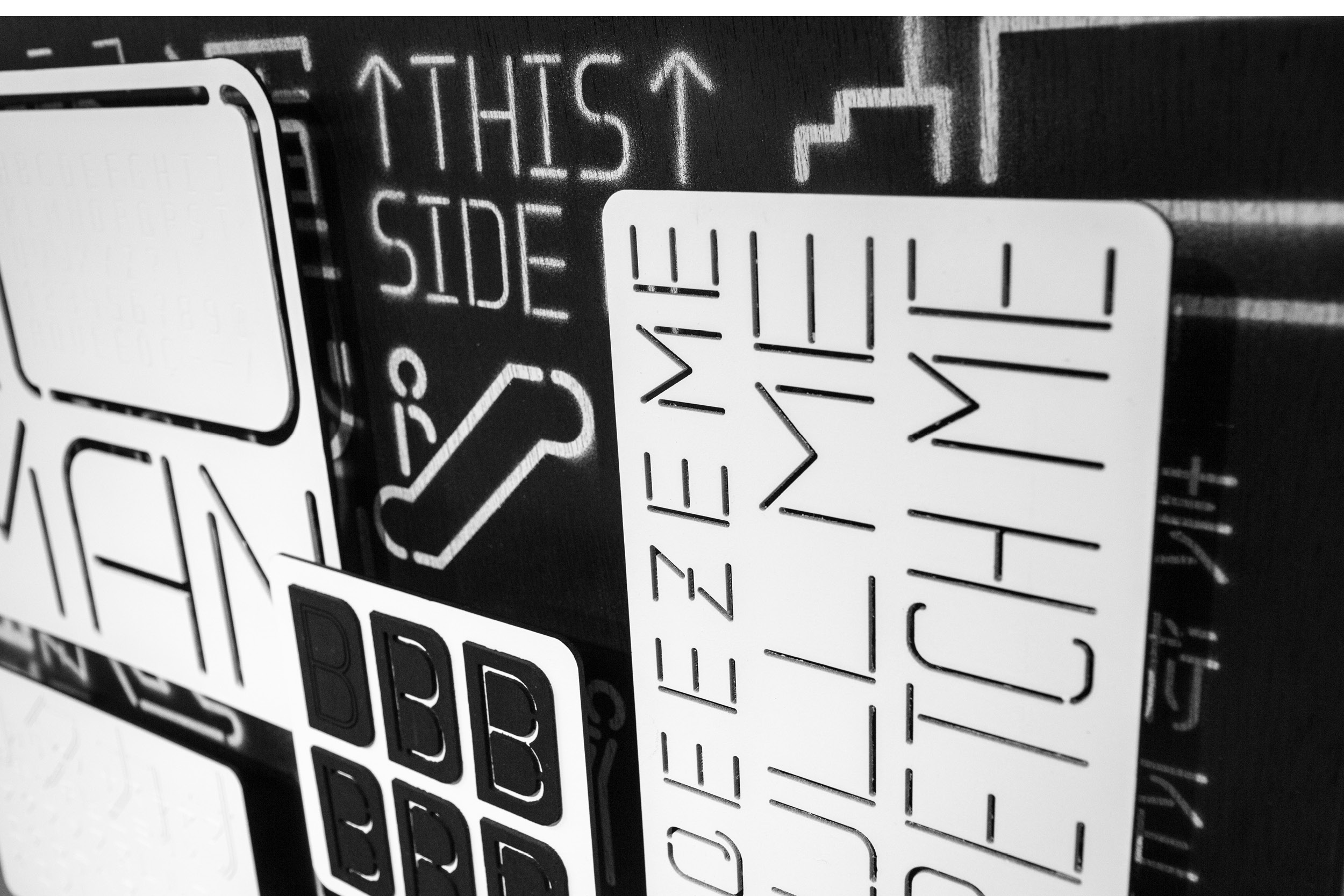
Transfont
Transfont is a system that allows you to combine various languages, numbers and pictograms, without losing the overall identity of the font. It is meant to be used as a headline and signage tool on boxes, buildings and vehicles but also in editorial publications. Stencil and neonlettering were the basis for the research that lead to the current status. Instead of altering the font when you need it as a stencil, the idea was to create a font that is ready to be used in such a way.
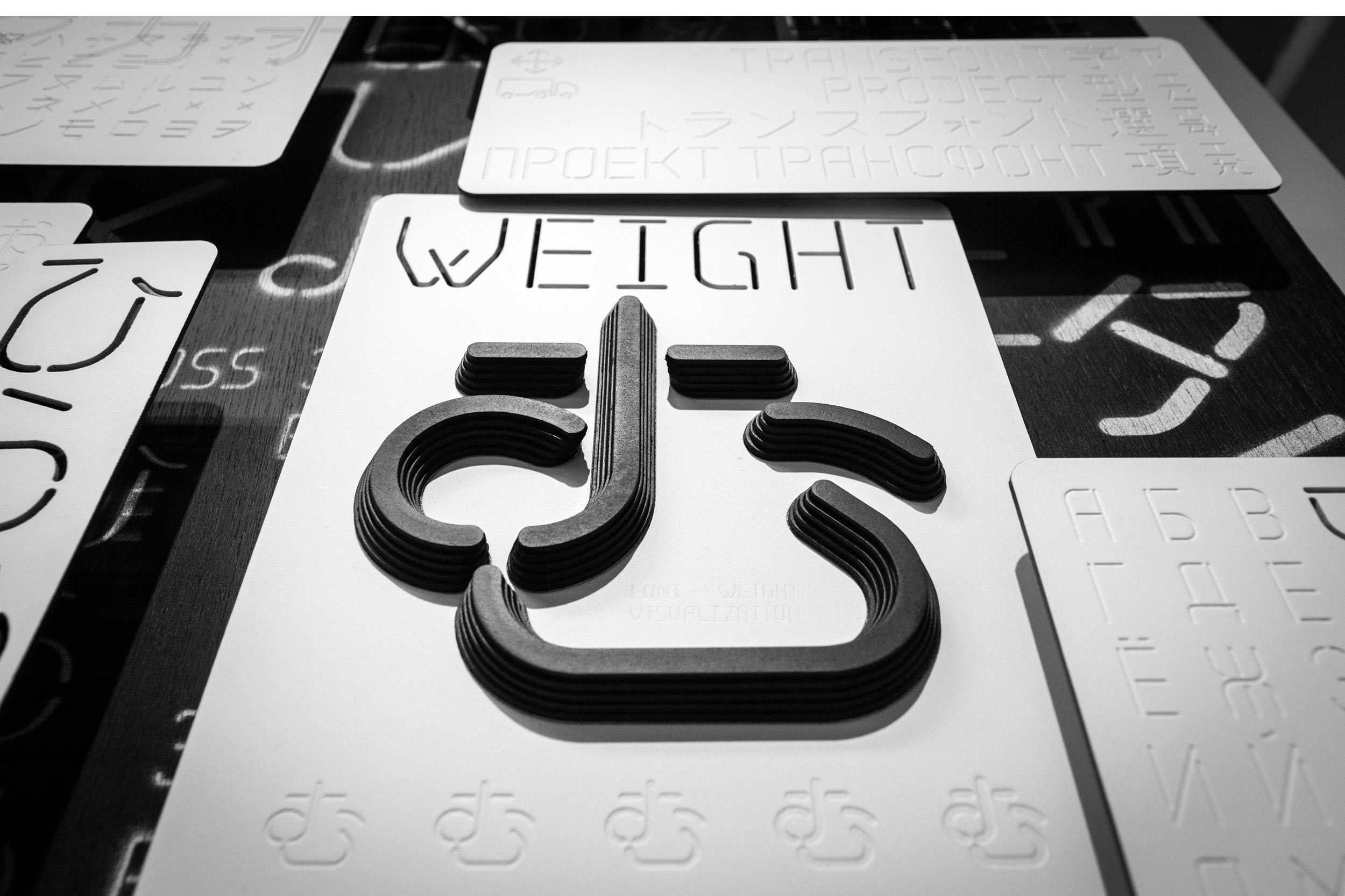
It is build with only a few basic rules. The stroke has always the same width, as well as rounded caps and corners. Everything is rounded to make production process easier and faster. You could cut stencils with a cnc-mill or just with a basic drill. Or build neon lights without having troublesome overlapping parts. Screenprinting as well as lasercut production methods should be easy applicable as well. Therefore you gain a lot of possibilities in application without doing any alteration on the font. This saves time and gives you new ways of approaching your identity.
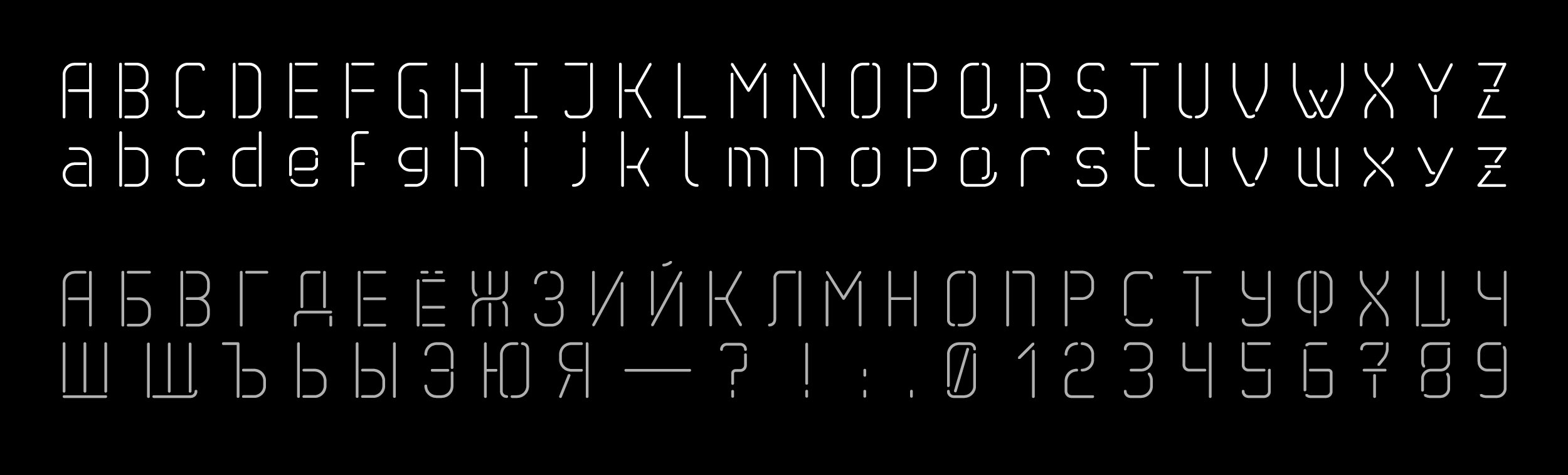
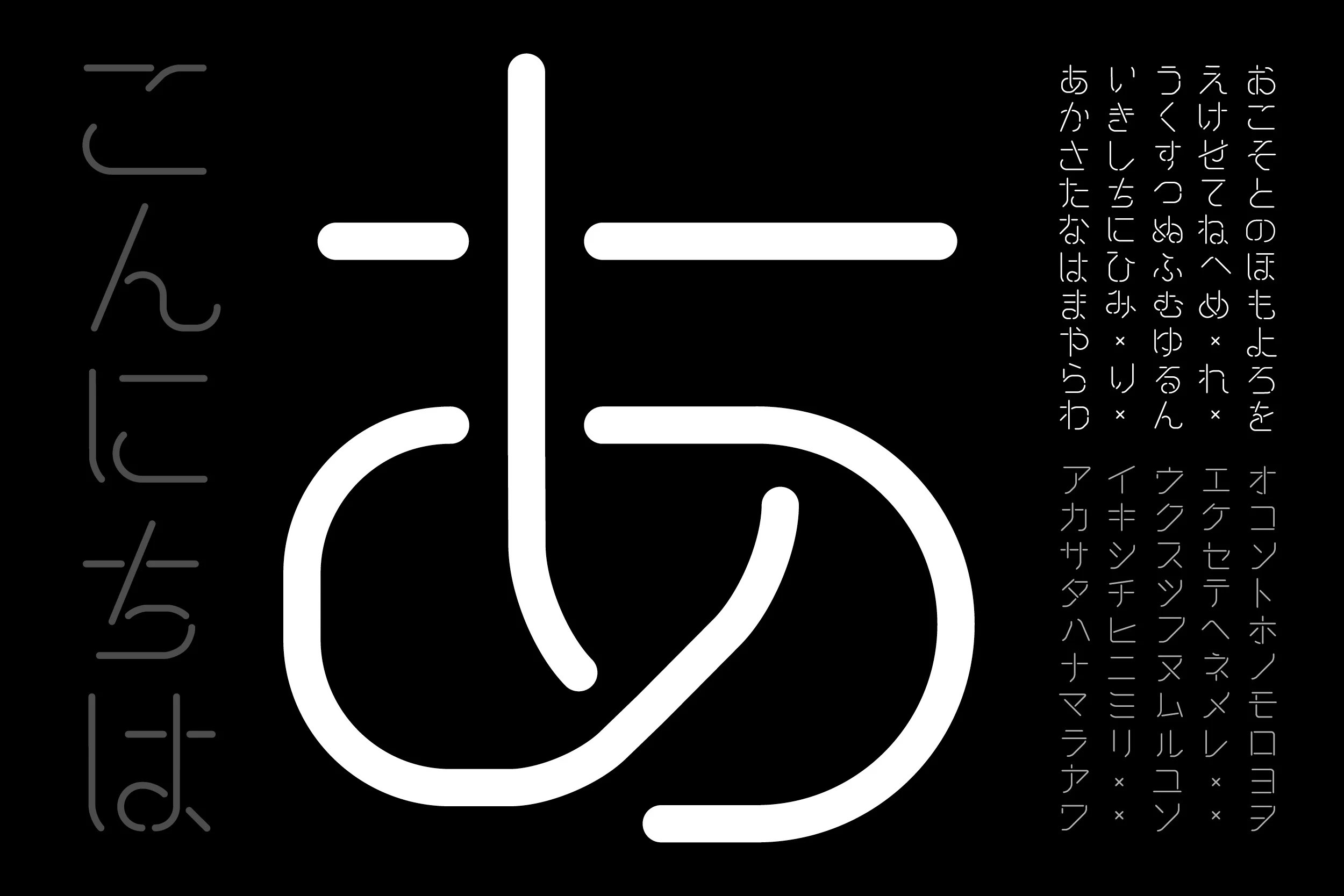
The font itself is geometrically build. Most parts are based on a 45° degree grid. Latin and cyrillic characters have half the space as kanji do and the x-height is exactly in the middle. This gives the characters a serious, formal, mathematical and neutral look. It was important to create a font that feels normal and not too overdriven in any way. Although it is crucial to have unique features in some characters like the ‘Q’ or the ‘W’, the overall feeling has to be natural. Therefore you get a usable font with a very unique look throughout your design work.
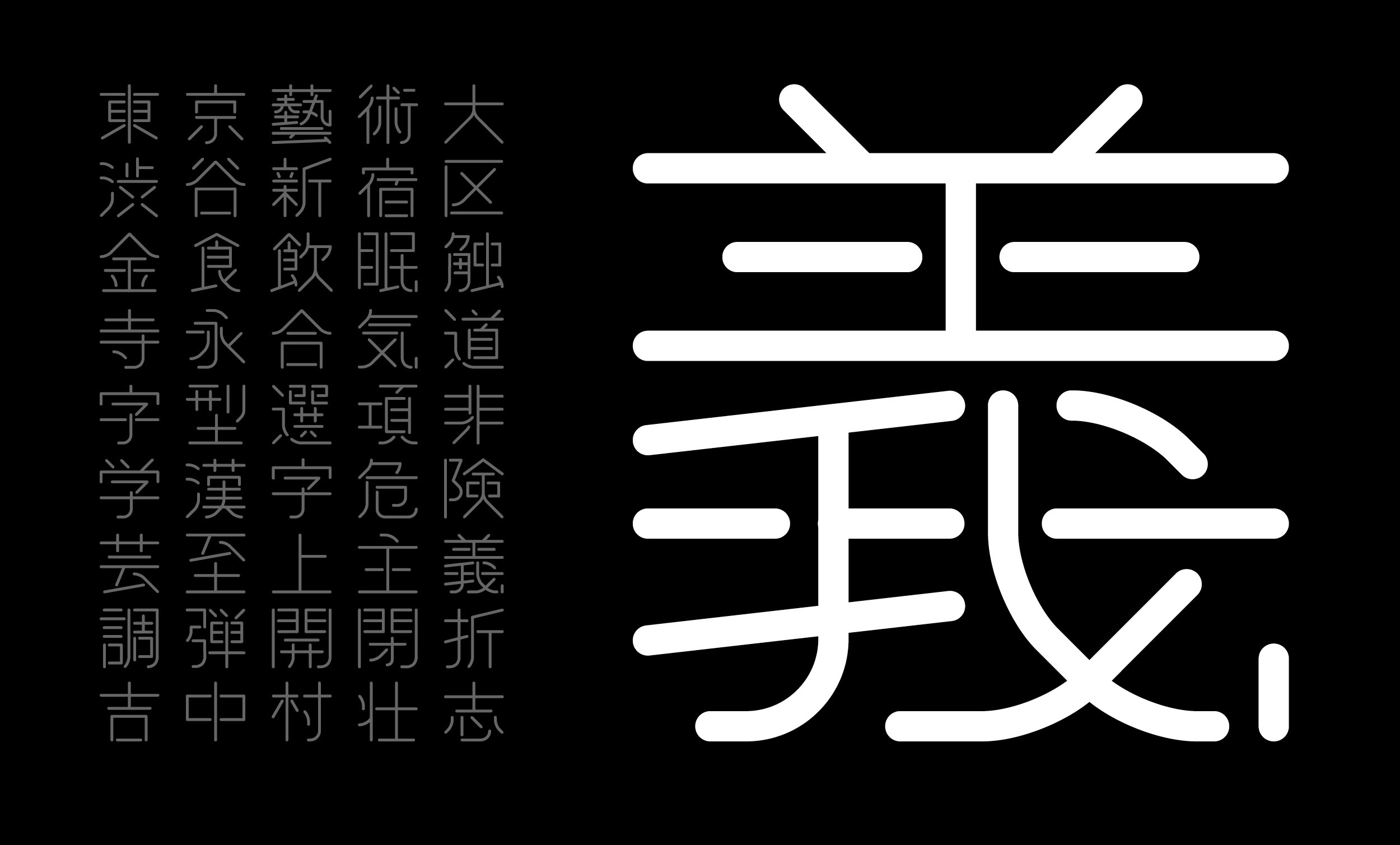
Kanji are made on demand with the same basic prinziples. Although it can be tricky to find the right composition, the system is flexible enough to create even complicated forms. It is even possible to create wide, tall and bold cuts if needed. The system allows quick modification and variation for special occasions without losing its original feeling.
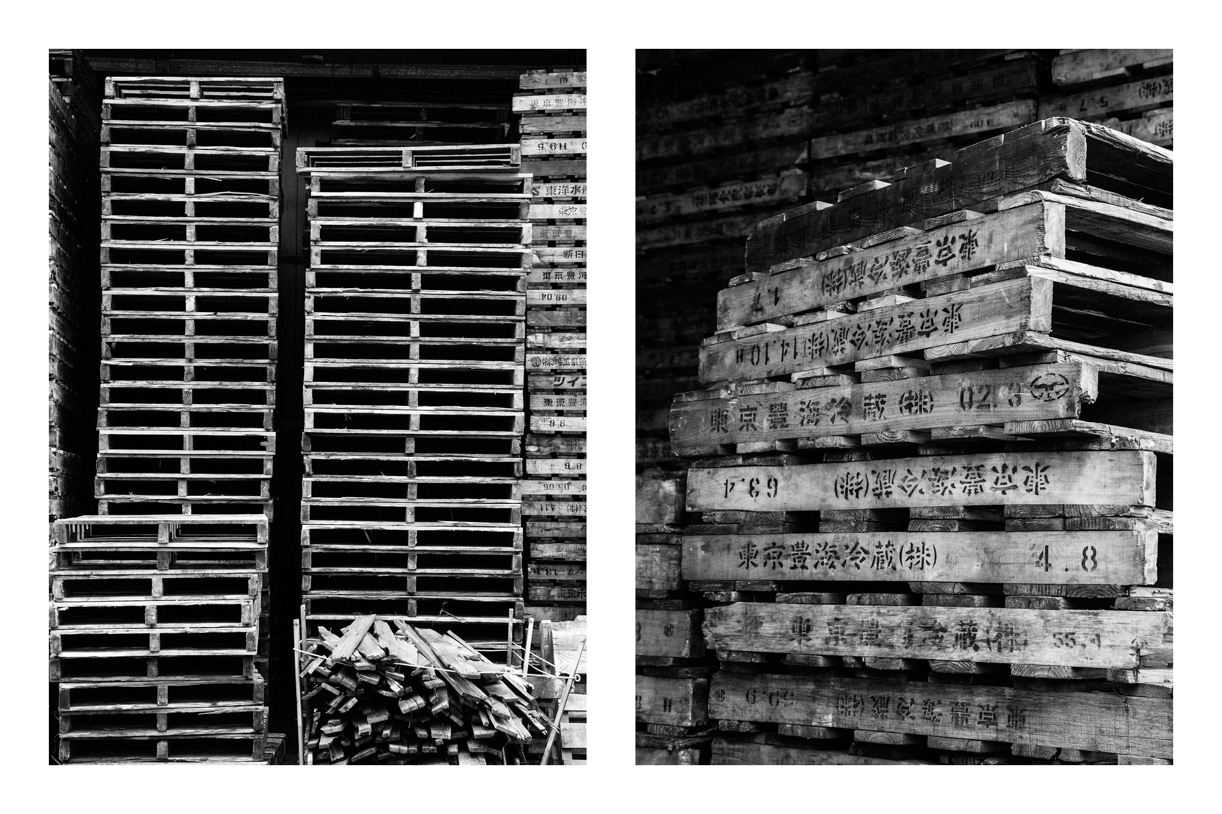
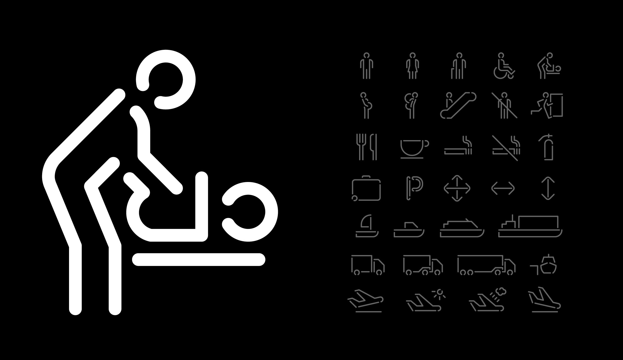
Transfont is meant to be applied in a corporate identity sector. A cargo and transportation company would be the ideal place to use it. The international and somewhat standartized look gives you a worldly feeling. Paired with endless possibilities of adding new languages you create something that can be utilized in almost every way possible. Pictograms, arrows and colorcode would be a nessesary addition to complete a true corporate identity solely based on a font.
To demonstrate this on a smaller scale I chose my final piece to be a wood installation. The object itself should feel industrial and heavy. The font on the other side should feel light and elegant. This oppositeness should prove the power of a simple system that is used throughout several materials and sizes. I want to try and find many ways of reproducing the font (lasercutting, printing, maybe cnc) to apply these methods on one single object. As a combined composition this object will serve as my prove of concept.


Transfont